

Today’s cabinet shoppers expect a web design experience that can offer the confident feelings they would receive in a showroom. They want to compare finishes, explore layouts, and check measurements without feeling overwhelmed. This is why the cabinet website UX (user experience) has been one of the most critical competitive edges in this market.
This guide explores the significance of UX in cabinetry eCommerce, explains how real shoppers behave online, breaks down design trends, and highlights what innovative tools can do to boost conversions. Additionally, you will see examples of cabinet brands with strong UX, providing valuable insights into how to optimize your online cabinet store.
Without further ado, let’s get into it!
The Role of UX in a High-Converting Cabinet Website
The cabinet website is the first impression visitors have of your brand. If the experience is smooth, informative, and immersive, they feel confident moving forward. Otherwise, it feels outdated or unclear; even the best cabinet will struggle to make a fast conversion.
Cabinet design UX goes beyond visual appeal; it’s about convenience and clarity through guided selling and user flow. The high UX focuses on removing friction, speeding up decision-making, and building trust, which are three key factors that can directly impact visitors’ decisions. With a complex, modular product like cabinets, shoppers often feel overwhelmed when browsing online. They need to clarify the size, materials, finishes, compatibility, and overall customization.
In short, an effective cabinet website UX is characterized by an exceptional journey. Visitors can easily compare options, have a smooth and intuitive checkout process, and even experience 3D visualization tools (e.g., a 3D visual configurator) to make more informed purchasing decisions. This can have a direct impact on conversion rates, quote requests, AOV, revenues, and ROI on your cabinetry website.
Core UX Principles for Cabinet Websites
1. Clarity-first information hierarchy for easier product discovery
Top cabinet websites often feature a predictable, straightforward information hierarchy. For example, here is how a typical cabinet product page should work to engage visitors:
- Introduce the product and a visual so visitors can know what they are viewing.
- Display key factors for custom choices: sizes, finish options, door styles, and more.
- Present prices and quotes in real-time or with the “Request A Quote” button.
- Preview technical specifications, installation instructions, and downloadable PDFs.
- Guide customers to finish their orders or forward them to the checkout page.
2. Intuitive navigation between cabinetry options
The navigation should be intuitive enough that users can easily switch between cabinet types with a single click, without losing their place or having to start over. Smooth filtering also plays a central role. Visitors can refine their options by size, type, color, finish, collection, material, and any other variants instantly. When filters load quickly and the interface remains stable, shoppers feel more in control of their browsing experience.
3. Mobile-friendly customization experiences
Your site needs to ensure interactive cabinet designs that are consistent across devices, including smartphones and tablets. In fact, revenue from mobile commerce is expected to reach up to $ 2.5 trillion by the end of 2025, accounting for 63% of retail e-commerce. Thus, without satisfying this perspective, your cabinet business is at risk of losing sales.
Here is what you should consider to embrace mobile responsiveness for your website:
- Tap-friendly buttons
- Large-clean visuals
- Smooth scrolling and filtering
- Simple lead forms
- Mobile-optimized cabinet customization tools
4. Accessibility considerations for custom cabinetry
Many visitors may feel overwhelmed by the technical details, extensive customization options, or the complexity of the shopping journey. Therefore, let’s ensure that every user, regardless of their ability, can easily navigate the site and make informed decisions.
For example, use easy-to-understand text, provide detailed descriptions of images and products, offer keyboard-friendly navigation, and display a preview of the checkout process (the number of steps buyers will encounter and the actions they need to take). All of these perspectives can create a smooth, beginner-friendly experience on your website.
Behavior Patterns of Cabinet Shoppers
To succeed with the UX for your cabinet website, it’s essential to understand shoppers.
Cabinet shoppers tend to spend more time comparing details than browsing inspiration. For example, they will hover across finishes, sizes, door types, hardware options, and internal storage features. Thus, if your site can’t support fast side-by-side comparison or provide a sufficiently accurate display, it’s hard to persuade them to proceed to checkout.
Customers also want to see high-quality, immersive visuals to clarify the style, as well as easy and smooth visualization of how cabinet pieces can fit their real-world environment. Last but not least, we need to address the friction points that they are dealing with, like:
- Missing installation instructions
- Unclear material quality
- Lack of real-time visualization
- Confusing naming conventions
- Limited customization previews
Satisfying all of these patterns of shoppers for cabinets is not easy. Businesses need to start with impactful UX features, lead modern trends, and create a distinct experience. Let’s take a look at the following section to note down essential features for your website.
High-Impact UX Features for Modern Cabinet Websites
Now that you understand what modern buyers expect from your website, you can start upgrading its performance with five core principles to enable a cabinet website UX here.
- Real-time 3D or AR visualization
The combination of AR cabinet visualization and real-time 3D previews helps you lead the 3D eCommerce trends in the furniture industry. When shoppers can rotate cabinets, explore interior storage, and then view the product inside their room with their phones, the buying journey becomes more apparent. This level of accuracy can help eliminate uncertainty about size and color matching, driving sales, and minimizing product returns.
- In-page configuration (sizes, doors, handles, colors)
You need to keep all essential customization options on a single page to ensure shoppers stay focused and prevent them from bouncing between different product tabs.
One of the most effective ways to deliver this experience is via 3D product configurators. These tools enable users to configure their own design with a range of selections in one interface and instantly preview how each choice affects the finalized cabinet design. As a result, customers can clarify designs in real-time without needing to open another tab.
- Layout planners for kitchen or storage setups
Because cabinets are part of a larger space, such as a garage or kitchen, shoppers often want to understand how cabinets come and fit with the projected environment. Thus, integrating 3D room planning that allows for drag-and-drop unit placement, adjustable room dimensions, and cabinet preview inside is essential. Customers can visualize and clarify spacing, as well as compatibility, making your site a much more reliable partner.
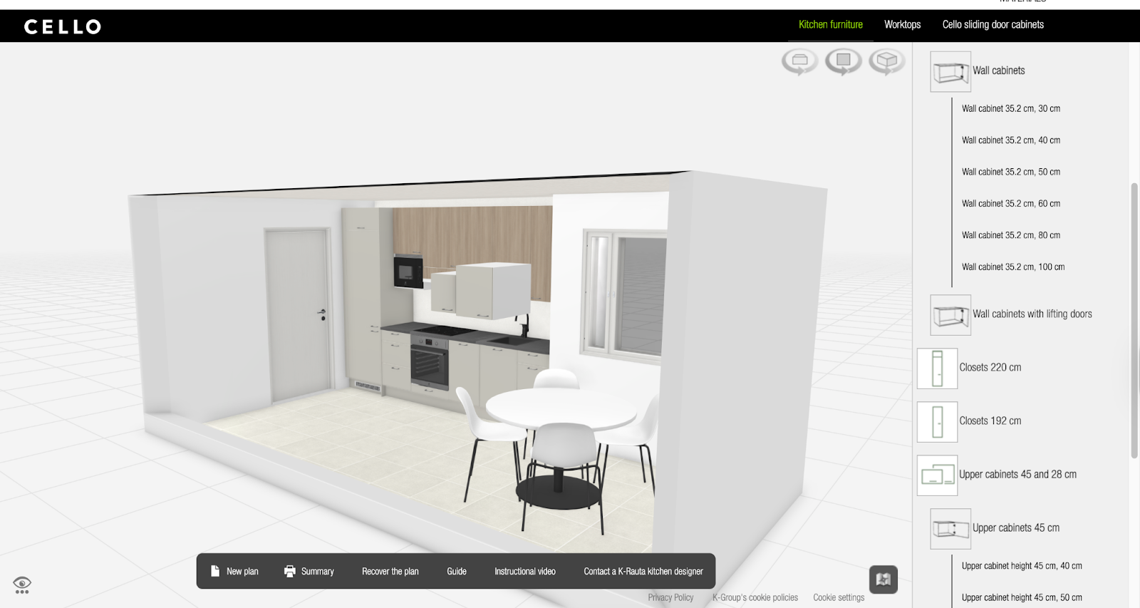
A notable example is the partnership between Kesko and VividWorks, which offers the ability to “Design your dream Cello kitchen”. Customers can create their own kitchen by using “Sample Kitchen”, “Room Base”, and “Base modification”, and select a lot of cabinets with proper sizes to put inside. Of course, this platform offers 3D visualizations, allowing users to easily preview every selection from all angles for more informed evaluations. Finally, you can access a comprehensive summary of the final design with just one click.
- Sticky spec sheets, downloadable PDFs, installation guides
Technical details play an essential role in cabinet purchasing. You can enable sticky spec sections that remain visible as the user scrolls, ensuring critical dimensions and materials are never lost. Downloadable PDFs, installation diagrams, and assembly guides also provide additional clarity for all customers, including B2B, B2C, and expert installers. Ultimately, you can enhance their trust, enabling them to close deals with confidence.
- In-line lead capture for custom cabinet requests
Since many cabinet clients require project-specific guidance, embedding context-aware lead capture within product pages can make a difference. Instead of directing visitors to a separate contact form, an in-line request box enables them to submit measurements, attach photos, or ask questions without interrupting their workflow. This captures interest at the moment of intent and helps your sales team engage with qualified furniture leads.
4 Design Trends Driving Furniture Website Performance
Design trends are found to have a direct impact on high-modular product designs, like cabinets. Therefore, if you aim to optimize the performance of your cabinet website's UX, it’s essential to review the list below and strategically integrate these trends into your site.
- Minimalist layout with spec-first structure
Shoppers researching cabinetry care less about dramatic visuals and more about precise measurements, materials, and compatibility. Leading sites now prioritize essential product data, thereby reducing cognitive load and enabling visitors to compare quickly.
- Micro-interactions for variant selection
Another effective design trend is the use of micro-interactions. Small but meaningful animations, such as swatch highlights, handle popovers, hover states, or door-style previews, make the interface feel more intuitive. These interactions provide instant visual feedback, guiding users through complex customizations without causing overwhelm.
- Shoppable room layouts
Interactive room layouts are becoming a cornerstone of high-performing furniture sites. By allowing shoppers to explore finished kitchens, pantries, or storage rooms and click individual cabinets for more details, you bridge the gap between inspiration and action. This helps customers understand how different units work together in real environments.
- Modular product storytelling
Instead of presenting cabinets as isolated products, leading brands break down content into digestible modules, including construction, hardware options, interior configurations, finishes, and layout possibilities. This helps customers evaluate cabinets precisely and efficiently, enabling them to move step-by-step through a clear and structured narrative.
Successful Examples of Transforming Cabinet Website UX
#1. Supra Cabinets
Supra Cabinets, a Sweden-based business, stands out with its made-to-order, stylish storage systems. This success is not only due to the quality and function of its products but also to the premium level of cabinet design UX that the business offers its customers.
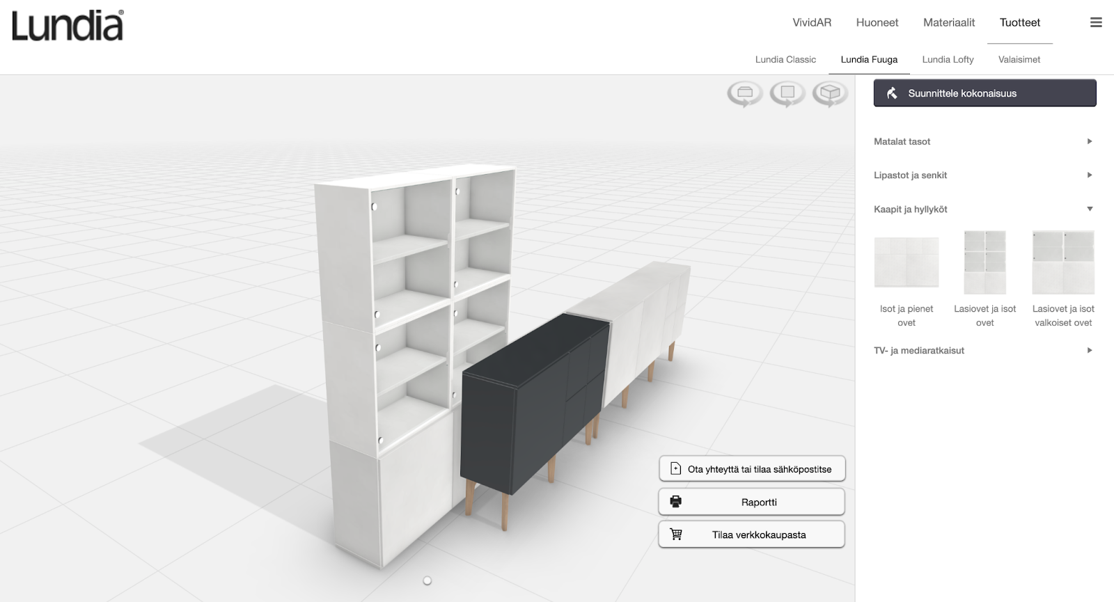
WooCommerce Storage Configurator for Supra Cabinets (Garageinredning.se)
Supra Cabinets partnered with VividWorks to implement a 3D cabinet configurator on their website. Customers can configure a desired cabinet and then preview it in 3D. This provides them with a clearer understanding of the final design, enabling better decisions. Moreover, this tool can work well with ERP systems for detailed Bills of Materials (BOMs).
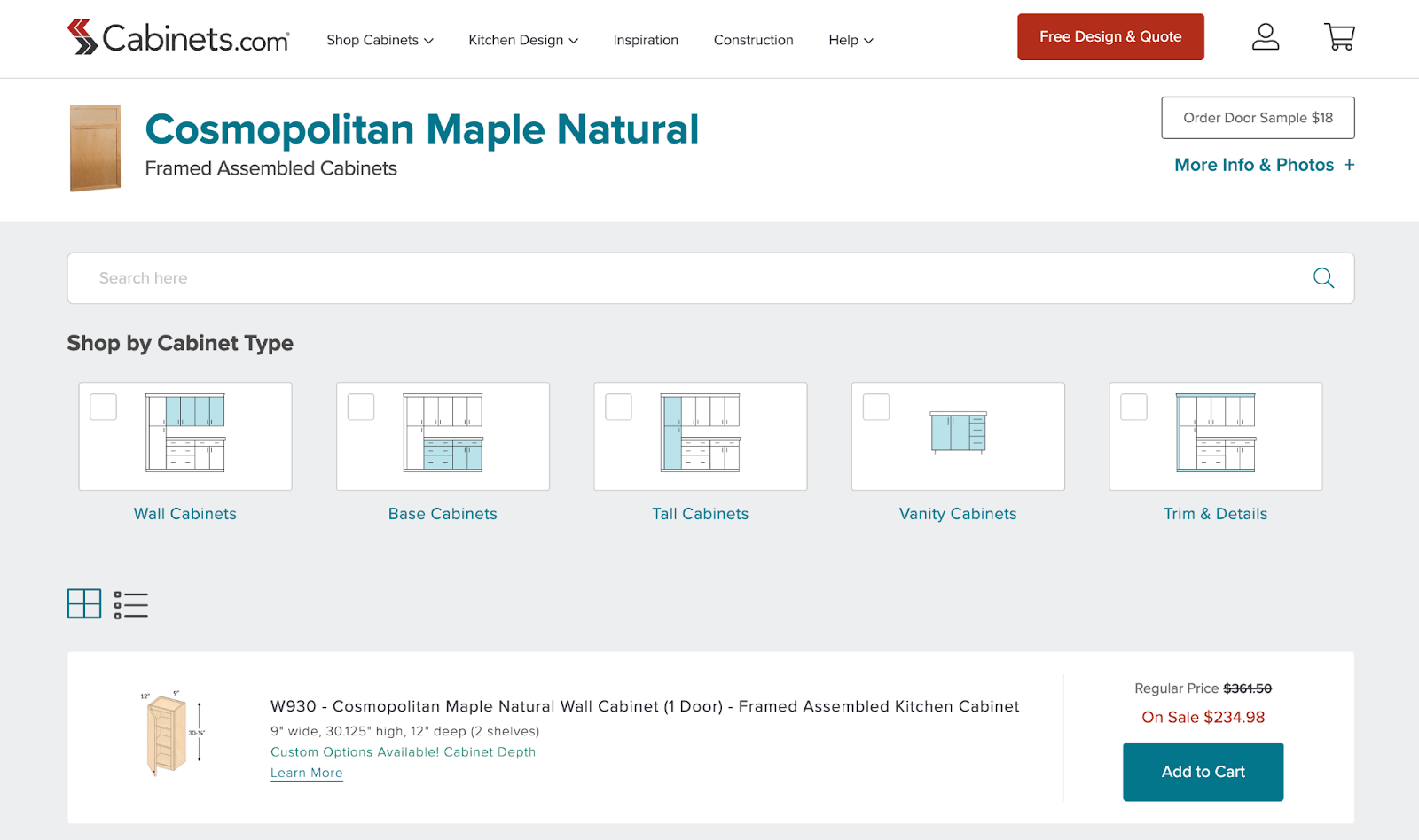
#2. Cabinets.com
Cabinets.com stands out for its straightforward, spec-first approach to kitchen cabinet design. Essential details, such as door styles and finish options, are presented upfront, supported by interactive animations that help shoppers compare variations immediately.
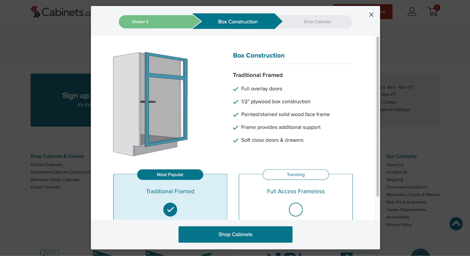
One notable feature of the website is that it clarifies the 3-step journey to finish a cabinet order: Product → Box Construction → Shop Cabinets. This makes the buying process feel predictable and straightforward, especially for first-time shoppers of these cabinets.
Final Thoughts
Hopefully, this article can help prepare for the best possible experience on your cabinet website UX. Book a demo to explore how 3D technologies can support your conversions. Finally, don’t forget to stay updated with emerging trends and continuous improvement, which ensure your journey remains modern and aligned with how buyers expect it to be.
Table of Content
-3.avif)
Streamline your process today!


